
The picture above is from a template I found on Philofaxy. I have events and schedule on the left page and to-dos for days of the week on the right.
I'm going to get these pens as well, I have one already in purple and one in black and they write really nicely. As my dividers are colour coded, I will use the following colours to indicate different things:
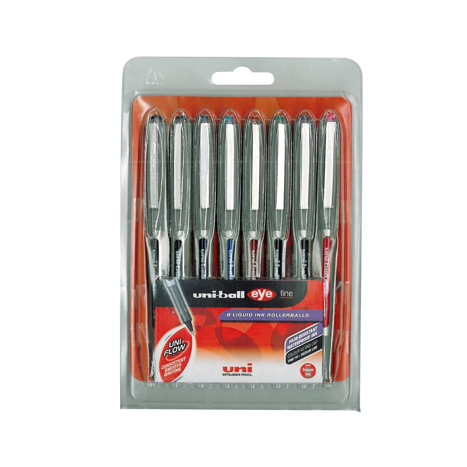
Purple - general schedule, work, health
Orange - money, travel, car
Red - notes, home, special dates
Green - bills, social
Blue - creative, entertainment
Yellow (or black as yellow doesn't show up well) - food, shopping
Will let you know how I get on in two weeks, and once I get my lovely pens!
2 comments:
Good choice.....
Those are nice looking pages.
Post a Comment